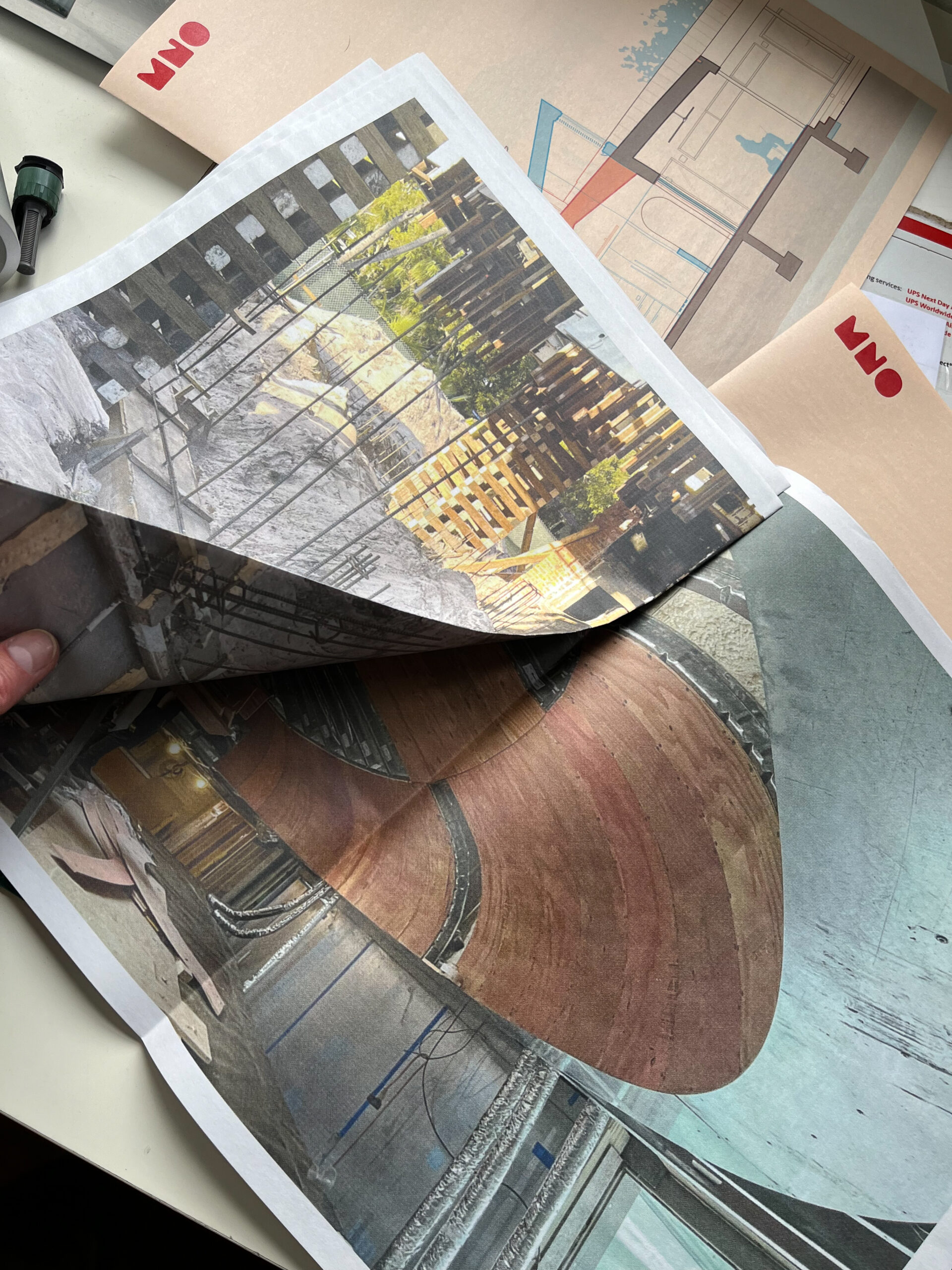
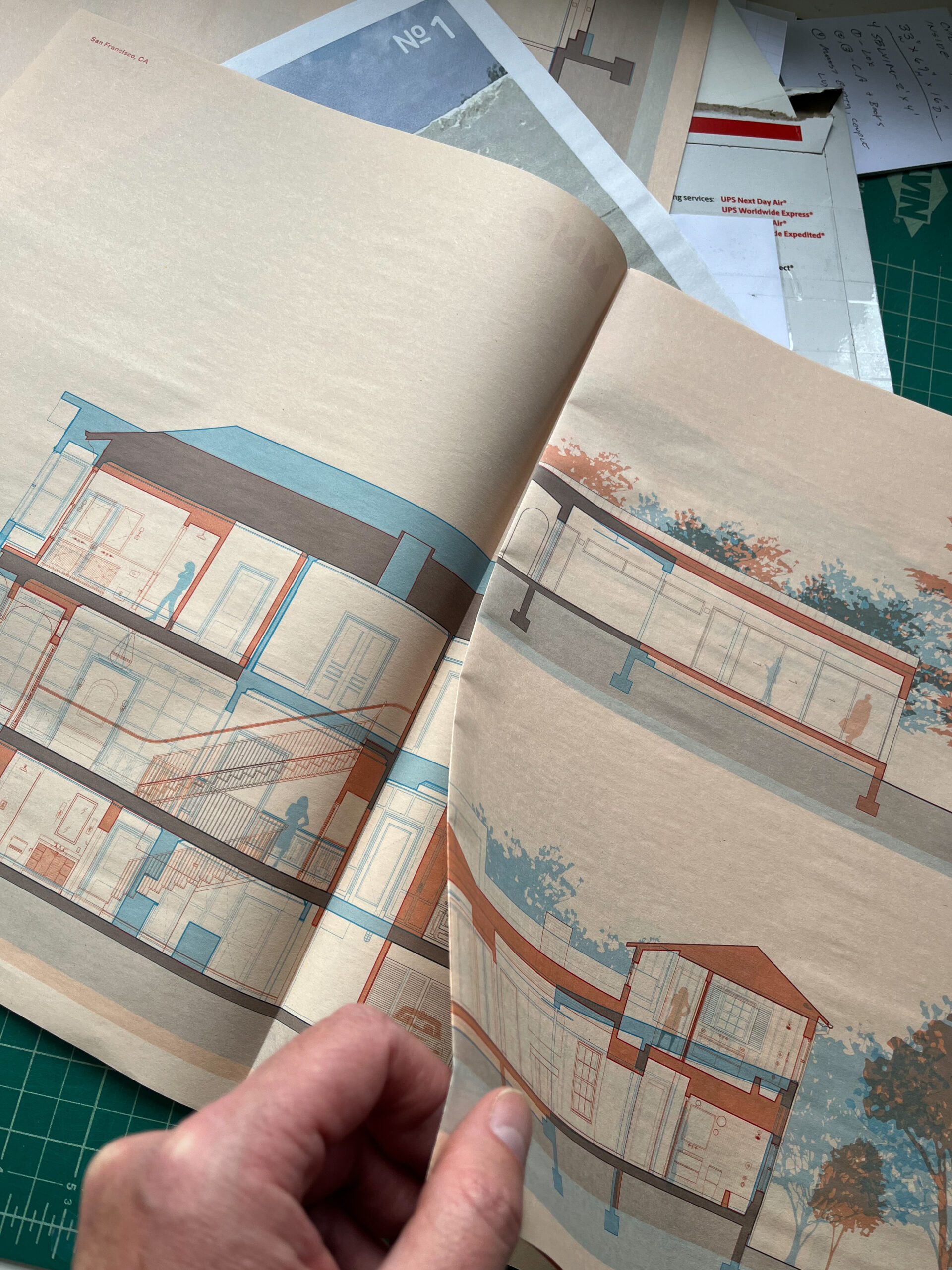
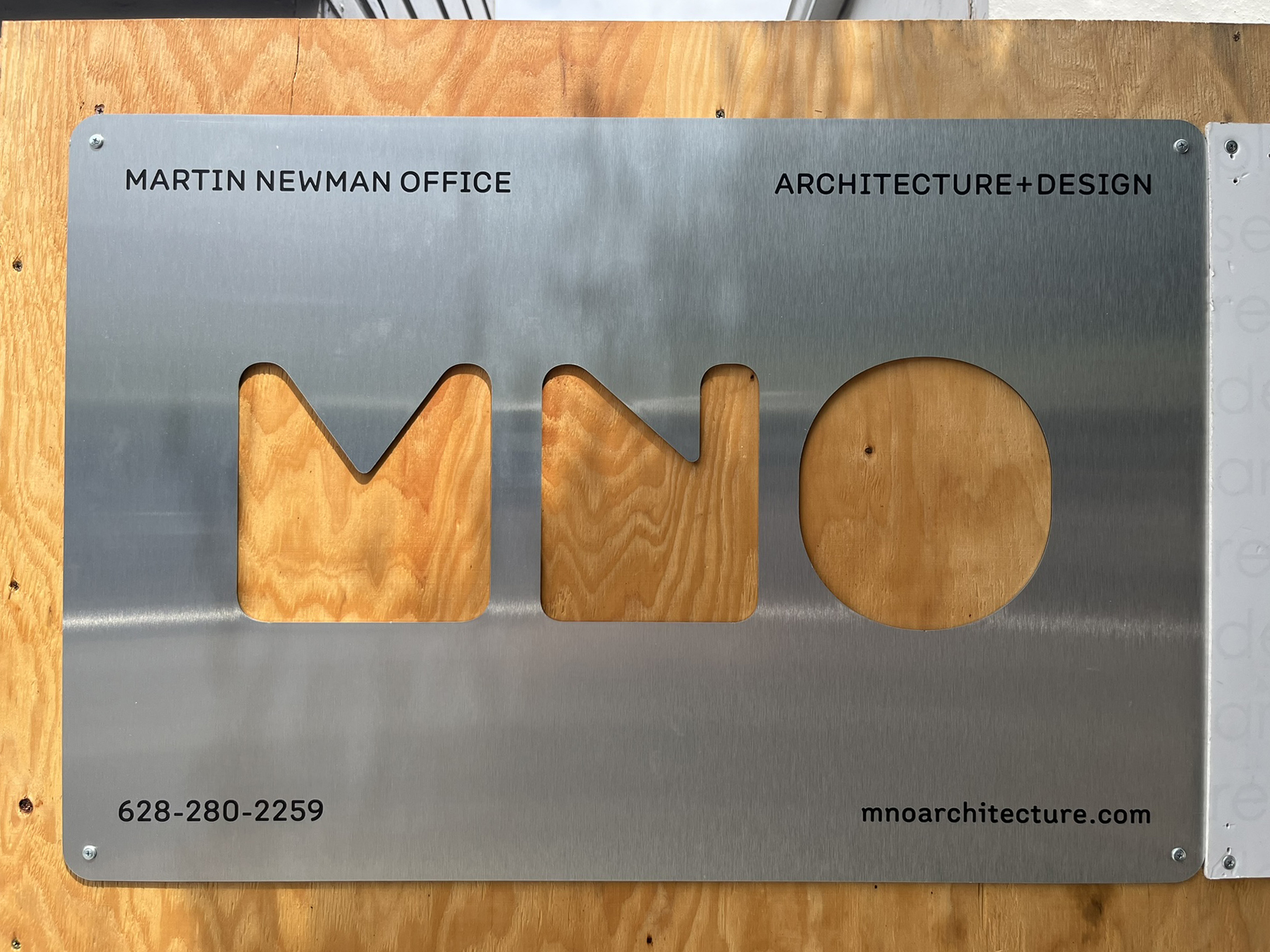
WORKING WITH A MENTOR TO ORGANICALLY CREATE A BRAND IDENTITY
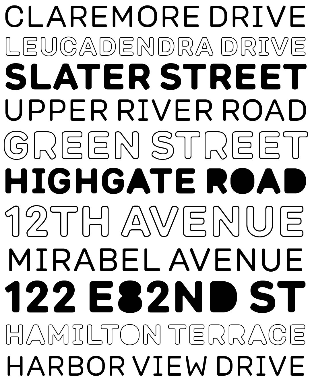
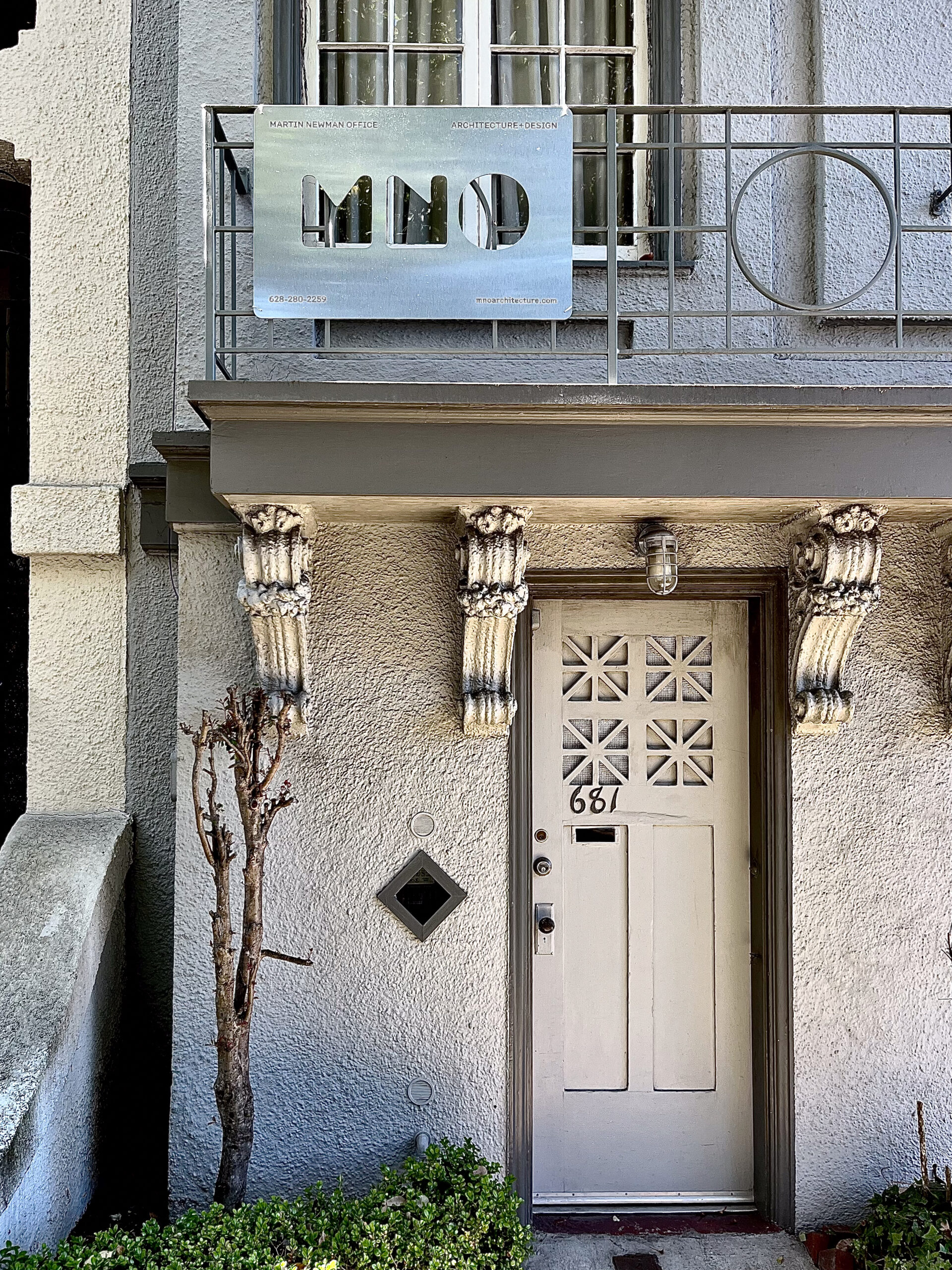
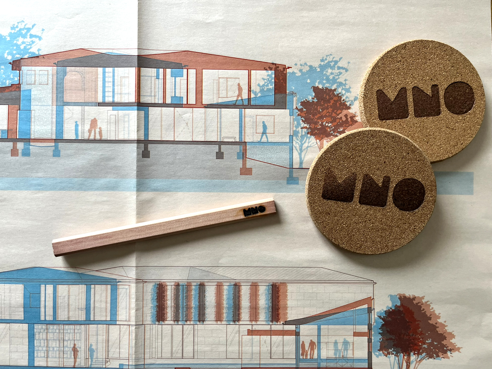
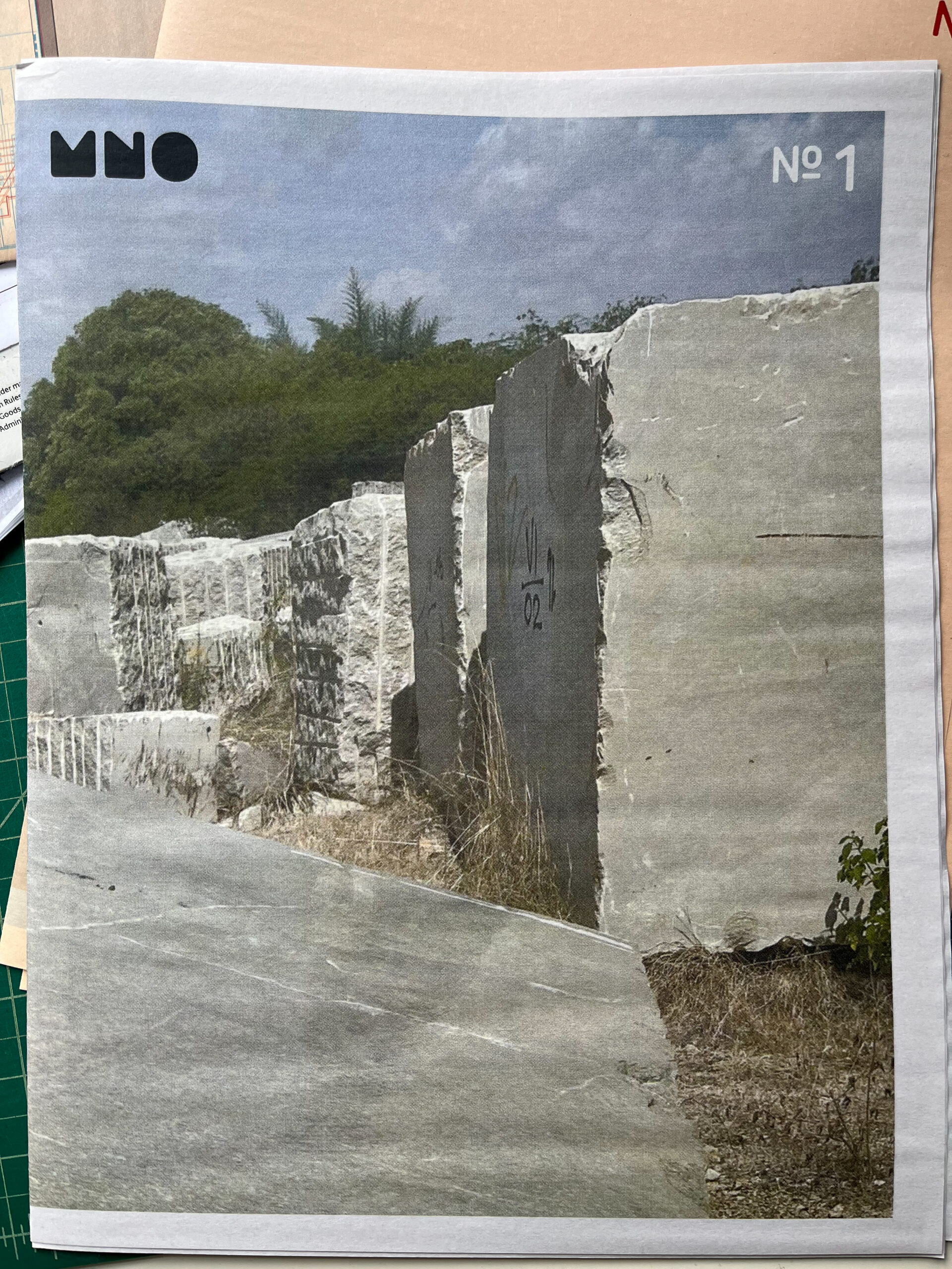
The story of the MNO graphic identity began back in 1998 when Brent graduated from Art Center College of Design and began working with Greg Lindy, now of Lux Typographic + Design. As Brent’s first mentor out of school, Greg helped train his eye for detail and appreciation of great graphics and composition. When Marc Newman joined the firm in 2021 it was time to rename and rebrand. The alphabetic nature of our name was the set up. Brent asked Greg to design the new identity by starting with a fully custom typeface. The concept developed into six cuts conceptually based on architects’ lettering templates and German industrial monospaced typefaces. The logo grew out of the knockout font, allowing for numerous stencil applications we have only begun to explore. Lux Typo continued with the design of the website and a host of ephemera. Brent takes the branding literally by wood burning the identity onto various swag items such as cork coasters and carpenter’s pencils. Our zine series uses our project process imagery to test out a variety of graphic expressions. We look forward to #3 coming out Summer 2025. If you would like to get on our mailing list for the newspaper feel free to shoot us a line here.